PageBuilderAccordion — Page Builder Accordion
Extension for Magento 2
User Manual
CopeX GmbH
Web: https://copex.io
Email: office@copex.io
Table of Contents
| Section | Page |
|---|---|
| 1 Requirements | 2 |
| 2 Configuration | 2 |
| 2.1 Accordion Settings | 2 |
| 3 Usage | 3 |
| 3.1 Adding an Accordion Element in Page Builder | 3 |
| 3.2 Configuring Content and Styling | 4 |
| 4 Frontend Output | 4 |
1 Requirements
- Magento 2.3 or higher (compatible with 2.4)
- PHP 8.1 or higher
- Magento Page Builder enabled
- Hyvä Theme or Luma Theme
2 Configuration
The module configuration is located in the Magento 2 backend under Stores > Configuration > Content Management > Page Builder.
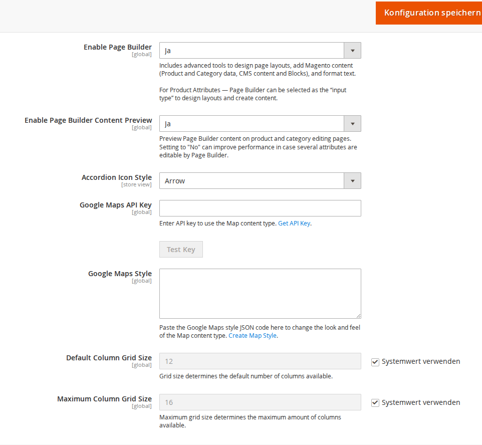
2.1 Accordion Settings
Navigate to Stores > Configuration > Content Management > Page Builder.
- Accordion Icon Style — Selects the icon for the open/close toggle of the accordion:
- Plus/Minus (+/-) — Classic plus-minus symbol
- Arrow — Chevron/arrow symbol
3 Usage
3.1 Adding an Accordion Element in Page Builder
After installing the module, a new Accordion content element is available in Magento Page Builder. It can be used in static pages, CMS blocks, and anywhere else Page Builder is available.
Adding an accordion element:
- Open a CMS page or CMS block in the backend under Content > Pages or Content > Blocks.
- Click Edit and then open the Page Builder editor.
- In the left panel under Content, drag the Accordion element to the desired position in the layout.
- The accordion element appears in the editor with a placeholder accordion.
3.2 Configuring Content and Styling
After adding the element, you can configure the accordion:
- Add accordion items — Each accordion item consists of a title and a content area. The content area can contain text, images, HTML, buttons, and other Page Builder elements.
Available CSS settings:
| Setting | Description |
|---|---|
| Alignment | Horizontal alignment of the accordion |
| Border | Border around the accordion (none, solid, dashed, etc.) |
| Border Color | Color of the border |
| Border Width | Border width in pixels |
| Border Radius | Corner rounding in pixels |
| Margins | Outer spacing (margin) |
| Padding | Inner spacing (padding) |
| CSS Classes | Custom CSS classes for individual styling |
4 Frontend Output
The accordion element is rendered in the frontend as a collapsible list. Each item shows only its title by default. Clicking the title expands the content area below it.
On the frontend, the accordion appears as a clearly structured content block. Visitors can expand and collapse individual sections to display longer content in a space-efficient way (e.g. FAQs, technical details, shipping information). The configured icon (Plus/Minus or Arrow) signals the current state of each section. If no accordion content has been added to the CMS page being viewed, only the regular page content is shown.
The icon symbol (Plus/Minus or Arrow) is displayed according to the setting under Stores > Configuration > Content Management > Page Builder > Accordion Icon Style.
The module is fully compatible with the Hyvä Theme and the standard Luma Theme. For the Hyvä Theme, a dedicated template (view/frontend/templates/pagebuilder/hyva/accordion.phtml) with Alpine.js integration is used, which is CSP-compliant.
License
Proprietary — CopeX GmbH. One license per production Magento instance. Test and development environments do not require an additional license.